BullCharts software is a charting and technical analysis system. Even though it is not a trading platform with buy and sell features (that is, you can’t trade shares from within BullCharts), it does include a market depth screen, much like your online broker’s market depth view.
The market depth view in BullCharts requires a live data subscription, and is not available on the end-of-day or snapshot data plans.
Whether you have a live data plan or just end-of-day, you can also use the BullCharts Market Scan feature to search for stocks with a high Balance of Power. See more details below.
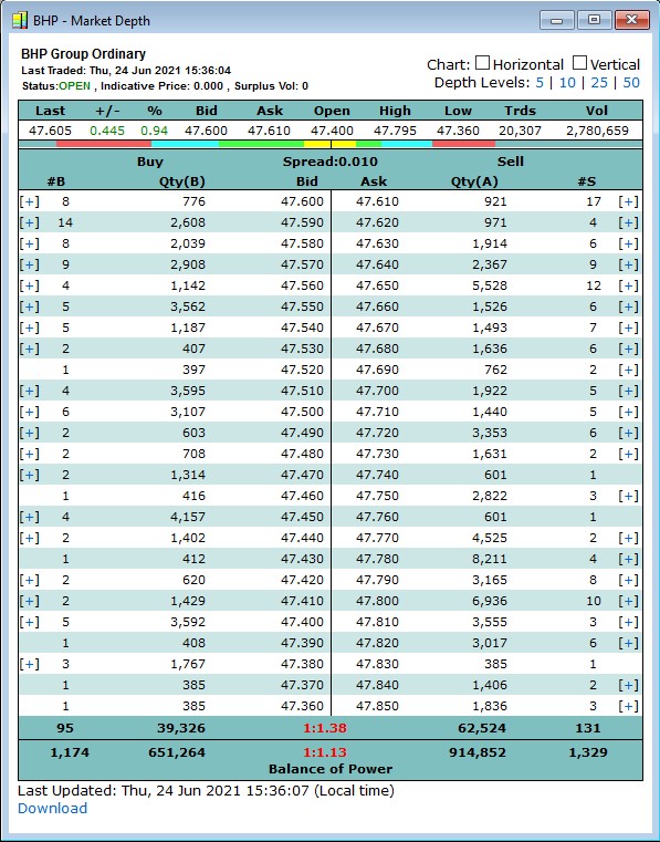
Market Depth – example
The screenshot above right (click on it for a larger version) is an example of the market depth for BHP taken during the trading day. Note that the BullCharts end-of-day data subscription will not enable you to see market depth in BullCharts.
Study the top portion of the market depth image at right and note that when this screenshot was taken, the last BHP trade took place on Thursday 24 June 2021 at 3:36pm. At that stage in the day’s trading session the last trade took place at 47.605, and the session’s Open, High and Low prices for the session to date are shown there, as well as the number of Trades and the Volume in the session up to the minute.
Market Depth – What is it exactly?
For anyone who is not familiar with market depth, the following is a brief overview. Most of the market depth window pane is a table of information with a list of potential Buyers down the left hand side and their “Buying” (or “Bid”) price, while the right hand side is a list of potential Sellers and their “Selling” (or “Asking”) price. Note that some people refer to the “buying” price as the “bid” price, and the “selling” price as the “ask” price (aka “offer” price).
Now focus on the top portion of this screenshot, and the first few lines in the table, as shown in the image below.
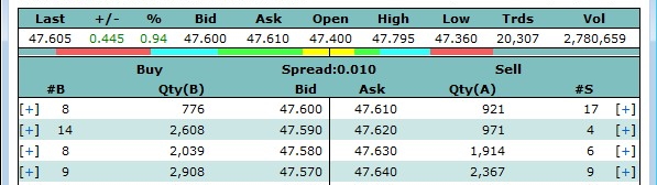
In this image, firstly notice that the last traded price shown in the top left corner was $47.605 for each share – that’s right, $47.60 plus a half a cent. That is, 47 dollars and 60 and a half cents (this can be done for some stocks under some circumstances). Now note that the first line in the table shows 8 potential Buyers bidding to buy a total Quantity of 776 shares at $47.60 each, while there are 17 potential Sellers offering to sell a total of 921 shares at $47.61 each.
Now if any Buyer steps up and bids a price that matches or exceeds the sellers asking price, then a trade will take place. That is, if a Buyer bids $47.61 (or any higher value), then a trade will potentially take place (if there are enough shares being offered). If all 8 Buyers can buy all 776 shares, then those entries in that top row in the left hand half of the table will disappear and the next row in the Buyers column will move up to be at the top of the queue. Conversely, if the Sellers are very keen, they could amend their asking price downward so as to match the bid price of the Buyers, and then a trade will take place.
This is essentially an auction process. If there is no match between the Buyers and Sellers, then no trade will happen and this market depth table will not change – and this does happen for hundreds of stocks on the ASX on a daily basis. If the trading is vigorous, and there are matching Bid and Ask prices then this table will change to reflect the changed information. A 12-second video of the market depth in action for a large blue chip and very liquid stock is shown at the bottom of this KnowledgeBase entry.
The Market Depth ribbon
In the above screenshots, notice the thin coloured ribbon that runs across the image just below the last traded price details. It is coloured yellow near the middle, then green towards the left and right, then light blue then red at the far left and right sides. This is simply a visual representation of the top four price levels of the market depth, based on the quantity of Bids and Asks. It can assist in a quick understanding of the trading action between the Buyers and Sellers. Watch it change in the 12-second movie below.
This ribbon is well demonstrated in the next screenshot below (of a very thinly traded stock), noting the key points below the image.
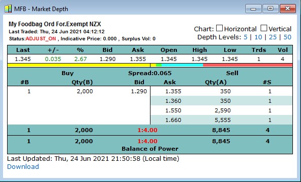
Remember that the market depth ribbon indicates the top four “levels” of the market depth. Now note the following key points in the above screenshot of MFB:
- In the list of Buyers shown on the left hand side there is only one potential Buyer, bidding to buy 2,000 shares. Therefore the ribbon (in the left half of the image) is all yellow. There are no other price levels on the Buy side.
- In the list of Sellers on the right hand side there are exactly four potential Sellers, so the ribbon is using all four colours – yellow, then green, then cyan then red.
- Notice the length of the yellow and green portions of the ribbon are fairly short compared to the longer light blue and the even longer red portion. This is because of the number of shares being offered for sale at each of these four price levels. There are 350 shares at $1.355, and another 350 at $1.36, so the yellow and green portions are the same length.
- Still on the Sell side there are 5,555 shares offered for sale at $1.66. Now this quantity of 5,555 is more than half of the total number offered (8,845), so the red portion of the bar is more than half of the total length available for the Sellers.
Market Depth – Column totals
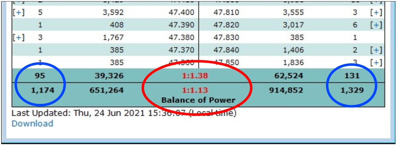
At the bottom of the market depth table are column totals (for the four outer columns, and not the two centre columns) and the “Balance of Power” indicator, as shown in the screenshot below (indicated inside the red oval). Note the following:
- The four column totals are for “#B” and “Qty(B)” to the left and “Qty(A)” and “#S” to the right.
- The “#B” and the “#S” columns have the total number of buyers (on the left) and sellers (on the right). Note there are two lines here where the first line shows the totals for the entries displayed on the screen while the second line shows the grand totals as if all lines in the market depth were displayed. In this example there are 95 buyers shown in the displayed table, but a grand total of 1,174 buyers. (For many stocks, the total number of entries down the list in the market depth table runs beyond the bottom of the table and are not displayed.)
- The Balance of Power is explained in the next paragraph below.
- The last line under the table, “Last Updated:…”, indicates the last date and time that this market depth screen was updated.
Market Depth – Balance of Power
At the bottom of the market depth table, along with the column totals, is the “Balance of Power” indicator as shown in the screenshot above. In this example the Balance of Power values are shown in red, but in some circumstances they can be green. Note the following:
- The “Balance of Power” values are a simple ratio of the number of Buyers to the number of Sellers.
- In this screenshot example, simply divide the number of Sellers by the number of Buyers.
That is: 131 / 95 = 1.38
So the ratio of buyers to sellers is one buyer for every 1.38 sellers. - When performing this calculation, use the larger of these two values as the numerator (Sellers) and the smaller as the denominator (95) so as to produce a result that is greater than one.
- In this example, the number of Sellers exceeds the number of Buyers, so the resulting Balance of Power is shown coloured red.
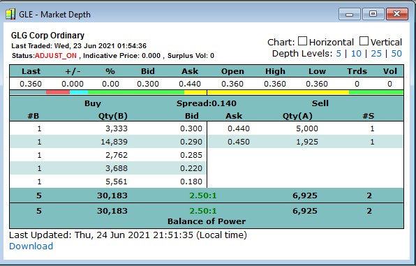
- If the number of Buyers was greater than the number of Sellers, then flip the two values over so as to produce a result greater than one, and the resulting Balance of Power will be coloured green as shown in the example below for GLE, and where the value for Balance of Power is easily calculated.
Scanning on Balance of Power
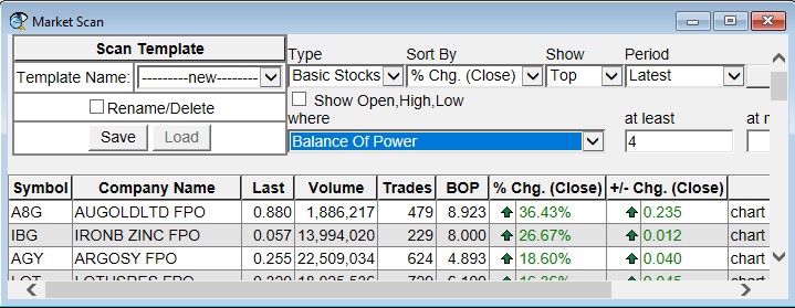
How would you like to run a scan to produce a list of stocks that currently have a Balance of Power that is strongly weighted in one direction? If there are an abundance of buyers wanting to buy a stock, it demonstrates the amount of interest in the stock for whatever reason. A high level of interest might last for a few minutes or hours, or even several days or weeks. There is a way to identify the stocks with a strong level of interest – Market Scan. Whether you have the BullCharts Live Data plan, or the End of Day data plan, this feature can be useful. The screenshot below is an example of using the Market Scan to find the stocks with a Balance of Power (BOP) greater than 4 times.
In summary, one of the key features of BullCharts is the Market Scan and it is a very useful scanning tool that includes the ability to scan on many fundamental and pricing choices. If you are on a BullCharts live data plan, Market Scan will also scan on live data giving you a unique view of the market at that point in time.
Just one of the many data items that you can scan across is the Balance of Power. This is discussed in detail in the next block below. For a lot more background information about the Market Scan feature, refer to Chapter 13 of the KnowledgeBase.
Accessing Market Scan

To access the Market Scan feature, use the BullCharts menu options: Actions > Market View > Market Scan
as shown in the screenshot at right.
Then the Market Scan screen will be displayed, and has several options to choose from. Of interest here is how to scan on Balance of Power.
Scanning for Balance of Power
In the Market Scan screen (as in the screenshot below – click on the image for a larger version), note there are several drop-down fields as explained below.
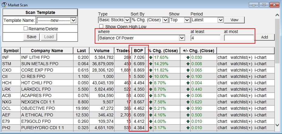
With reference to the above image, note the following (ignoring the “Scan Template” block):
- Firstly, select your scan criteria using the various drop-down fields, then click on the “View” button to process your query request and display the results.
- The first row of drop-down fields includes: Type, Sort By, Show and Period. The final item there is the “View” button. For most users this will at least be: “Type=Basic Stocks”.
- Note the second row of drop-down options, and note the drop-down labelled “where” which has many different data items on which to scan. From this drop-down, click on “Balance Of Power”.
- Then further along that line you can choose the minimum value of BOP that you want to scan for, and possibly an upper value (the upper value is optional – just leave it blank).
- Once you have set these parameters, click on the “View” button to perform the scan and display the results (within seconds).
- Then you can revise your selection and enter a different value to scan for, for instance, and click on the “View” button again to re-run the query scan.
Market Depth in action – a 12-second movie
This very short movie shows the market depth in operation during a trading day, for a large and liquid blue chip stock. In the 12 seconds that this movie will run for, there are several trades; but many stocks on the ASX trade much less frequently than this with some trading on average only once every hour or even less frequently.
You need to watch this 12-second movie very intently because at a glance it might appear not to change. Some of the things to watch out for are listed below.
Market depth observations in this movie:
- Keep an eye on the “Last” traded price which is 47.465 at the start, and also the values in the columns headed “#B” (number of buyers) and “#S (number of sellers). At the end of this 12 second movie the Last traded price was $47.460.
- Also watch the two “Qty” columns as the trades take place. These numbers change with each trade.
- The number of “Trds” for the session was 22,348 at the start of this movie (an average of 62 share parcels traded every second during the session), and by the end of this 12-second movie the Trds value had increased to 22,367. (A trade is the exchange of a quantity of shares between a Seller and Buyer).
- The “Vol” (volume) for the session was 3,006,564 at the start of this movie (about 8,350 shares traded every second), and at the end of this 12-second movie the Vol had increased to 3,009,598.
Note that BHP is a heavily traded stock, and that there are hundreds of stocks on the ASX that do not trade as often as BHP does throughout the trading day. This is related to the liquidity of the stock.
Author: Robert Brain (aka Brainy)
Australian BullCharts User Group convenor