To aid with the readability of a price chart, it is possible to either show, or hide, the grid lines on a price chart, and then to customise them by making the grid lines darker or lighter, and to change the line style from solid to dotted, etc.
Example grid lines
Below is a sample price chart showing customised grid lines. They are explained below.
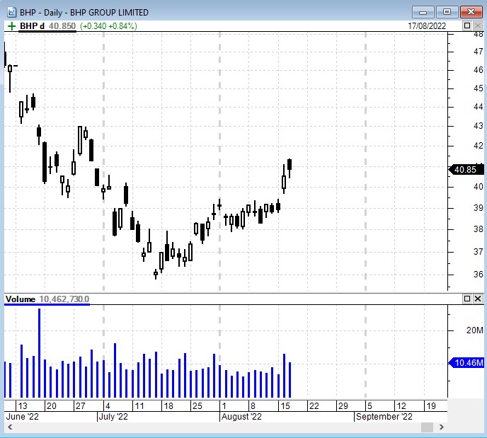
In the above example, note that there are major and minor vertical grid lines as follows:
- The major grid lines shown here are a dashed and thicker vertical line, shown ion each month boundary.
- The minor grid lines are the fainter dashed lines that are shown on the week boundaries.
How to display/hide the grid lines
If you would rather have no grid lines displayed, there are two ways to change the display settings as follows:
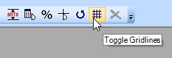 Click on the toolbar button which is normally shown near the top right corner of your BullCharts window (see the screen shot at right). This will toggle the display of all grid lines off, then on, then off;
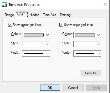
or:- Right click anywhere on the Time Axis across the bottom of the chart, and select “Time Axis…”, then click on the second tab labelled “Grid”. From here you can select to show either the minor or major grid lines, or both sets of grid lines (as indicated.
How to customise the grid lines
To customise the grid lines, right click on the Time Axis and select “Time Axis…”, then select the “Grid” tab (as explained in the previous paragraph). From there you can change the colour of either set of grid lines, as well as the style, and the line width.
The horizontal grid lines
To customise the horizontal grid lines, right click on the vertical price axis and from the
drop-down menu select: Price Axis Properties, then the “Grid” tab.